Chinese Bronze Mirrors: Han-Era “Transparent” Backings Explained

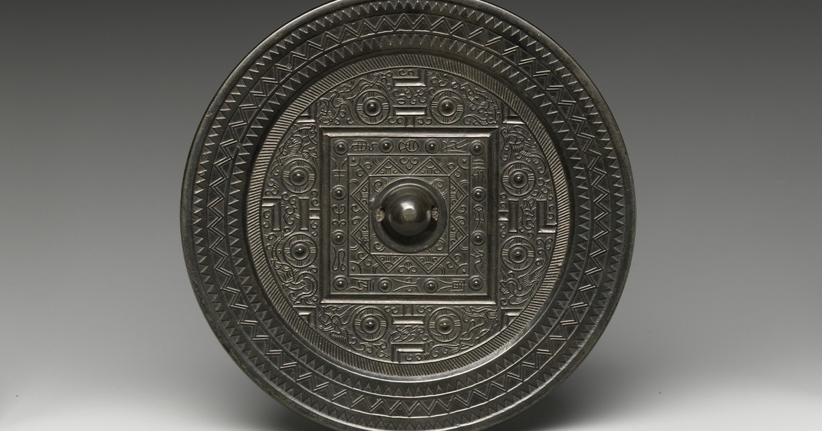
Hold a Han dynasty bronze mirror in good light and you meet a paradox. The front is a calm, shining surface. The back bristles with bosses, bands, and inscriptions. In rare cases, when a bright beam hits the polished face and reflects onto a screen, the decoration from the back seems to appear in the reflected light. It feels as though the bronze has turned transparent. Of course, it hasn’t. What you’re seeing is an optical projection that ancient craftsmen coaxed from alloy, heat, and patient polishing.

Later writers called such objects “light-penetrating mirrors” because the pattern looks as if it passes through solid metal. The effect sits at the edge where craftsmanship meets physics. Once you learn how the trick works, the wonder doesn’t vanish; it just moves from stage magic to technique. A good mirror records touch. It remembers every scrape, burnish, and rub. Under bright illumination, that memory becomes an image.

Bronze, moulds, and finishing: how a Han mirror begins

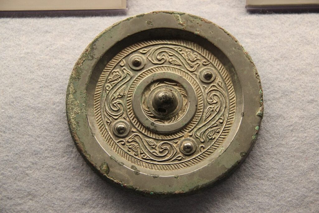
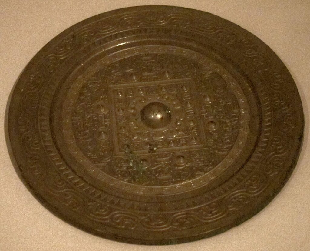
Han mirrors start as cast discs of a copper-tin-lead alloy poured into clay or bronze moulds. The workshop forms the back with its bosses and geometric fields while the metal is still liquid. After cooling, the face is worked into a gentle convex curve. Scrapers and abrasives remove casting skin. Burnishers bring up a shine. A final polish can include tinning or a mercury-tin treatment to boost reflectivity, depending on period and practice. Each step matters. Every stroke changes thickness and introduces microscopic warping that later shapes the way light scatters.

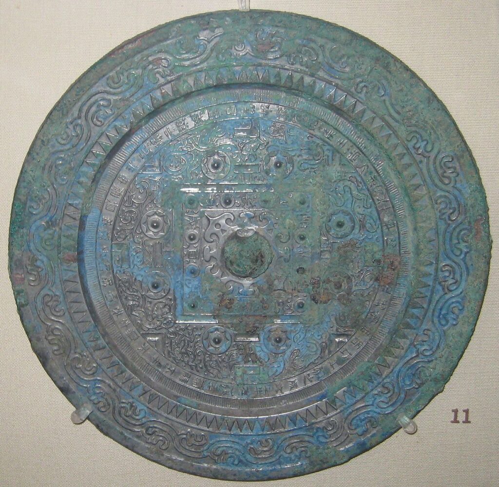
Look at the backs and you see order: TLV diagrams with right angles and arcs; swirls and spirals; inscriptions promising fortune; beasts of the four directions guarding the quadrants. These patterns are not just pretty. They reflect ideas about cosmology, rank, and virtue. They also provide the workshop with a strong relief that, indirectly, influences the face during finishing. While most Han mirrors never project their backs, the small subset that do are the ones that generations of collectors and scientists call “magic.”

The “transparent backing” explained simply

The effect is optical, not mystical. When you reflect bright light off a highly polished, very slightly warped surface, tiny differences in curvature make brighter and darker spots in the reflected beam. If those minute undulations correlate with the relief on the back — because of how the disc was thinned and polished — the pattern appears in the light on a screen. To the eye, the face still looks smooth. Under the beam, the surface writes with light.

Think of it this way. A perfectly flat mirror would throw an even patch of light. A subtly bumpy mirror throws a patterned patch. The Han craftsman doesn’t need to carve the image on the face. He allows the finishing process to echo the back’s structure in micrometre-scale undulations. The back provides the theme; the face plays the variations. Under strong illumination, the wall becomes the page and the mirror the pen.

Where the pattern comes from: three forces working together

First, the cast relief. The back is proud with bosses and ribs. Casting sets up internal stresses and a distribution of thickness across the disc. Thin zones cool differently from thick ones. Those differences matter later, once tools begin to scrape and polish the front.

Second, mechanical finishing. Scraping, stoning, and burnishing transform a rough cast into a mirror. The worker presses hardest at points that already sit slightly proud. Pressure, heat from friction, and removal of metal together create a face that is smooth to the eye but subtly varied in curvature. In some workshops, the polishing rhythm followed stable habits, which is why certain hands seem to produce the effect more reliably than others.

Third, surface treatment. Historical sources and surviving mirrors point to tinning and amalgam techniques that leave internal stresses. As the treatment sets and the metal ages, the face “relaxes” into a micro-topography. That topography is the script the light reads.

What the Han mirror meant in life

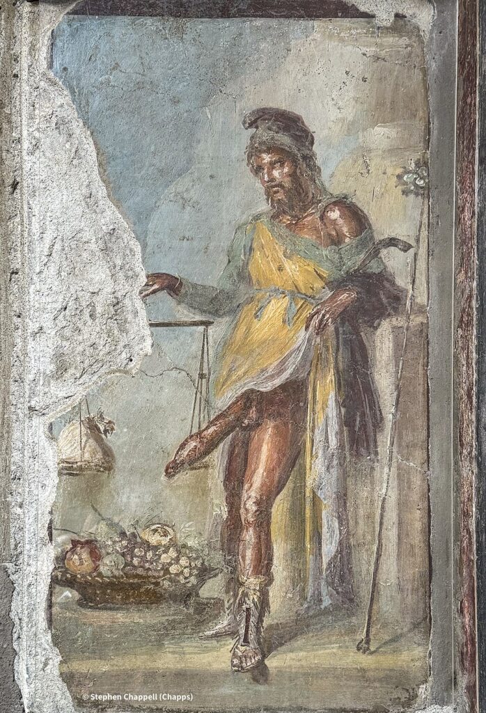
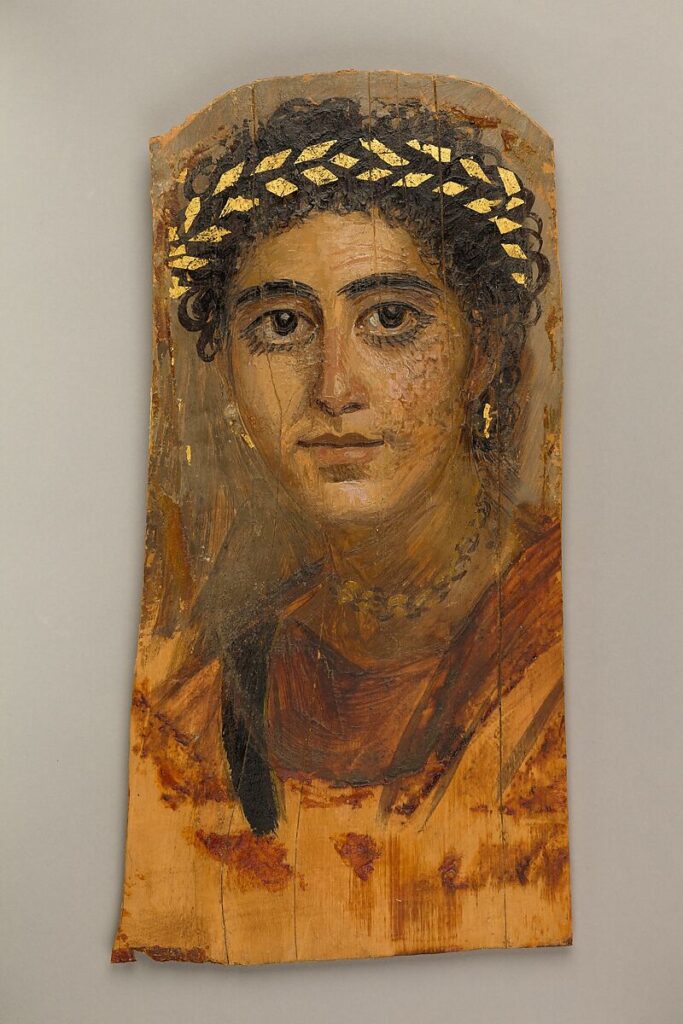
Mirrors circulated as gifts, dowry goods, and everyday tools. In poetry and ritual, they symbolised clarity and right conduct. The backs preach virtue in tight, formulaic phrases; the fronts promise an honest reflection. TLV designs and four-beast schemes carry cosmological meaning: square within circle, heaven over earth, cardinal beasts guarding order. A mirror could be buried as a comfort for the dead and an emblem of status for the living. Most were practical; the special few that “write” with light sit at the overlap of craft pride and elite curiosity.

TLV back with inscription and bosses, British Museum.
TLV back with central knob, bosses and inscription. CC0. Source: Wikimedia Commons / British Museum.

How to recognise the “magic” set without damaging anything

You cannot spot the projection effect by eye alone. A face that looks mirror-smooth can still carry the micro-warps that generate an image. The safe approach is entirely non-invasive: aim a bright, collimated light at the face and observe the reflected patch on a matt screen several metres away. Rotate the disc slowly. If an image appears, it will resolve as you find the right angle and distance. Conservators prefer controlled lab light and short sessions; the objects are old; patience is part of the method.

Even when a mirror projects a pattern, it is not always a perfect match to the back. Expect a ghost: a softened echo of bosses and bands, not a sharp drawing. The wonder lies precisely there — a whisper of structure, floating in light, telling you how sensitive polished metal can be to force, heat, and time.

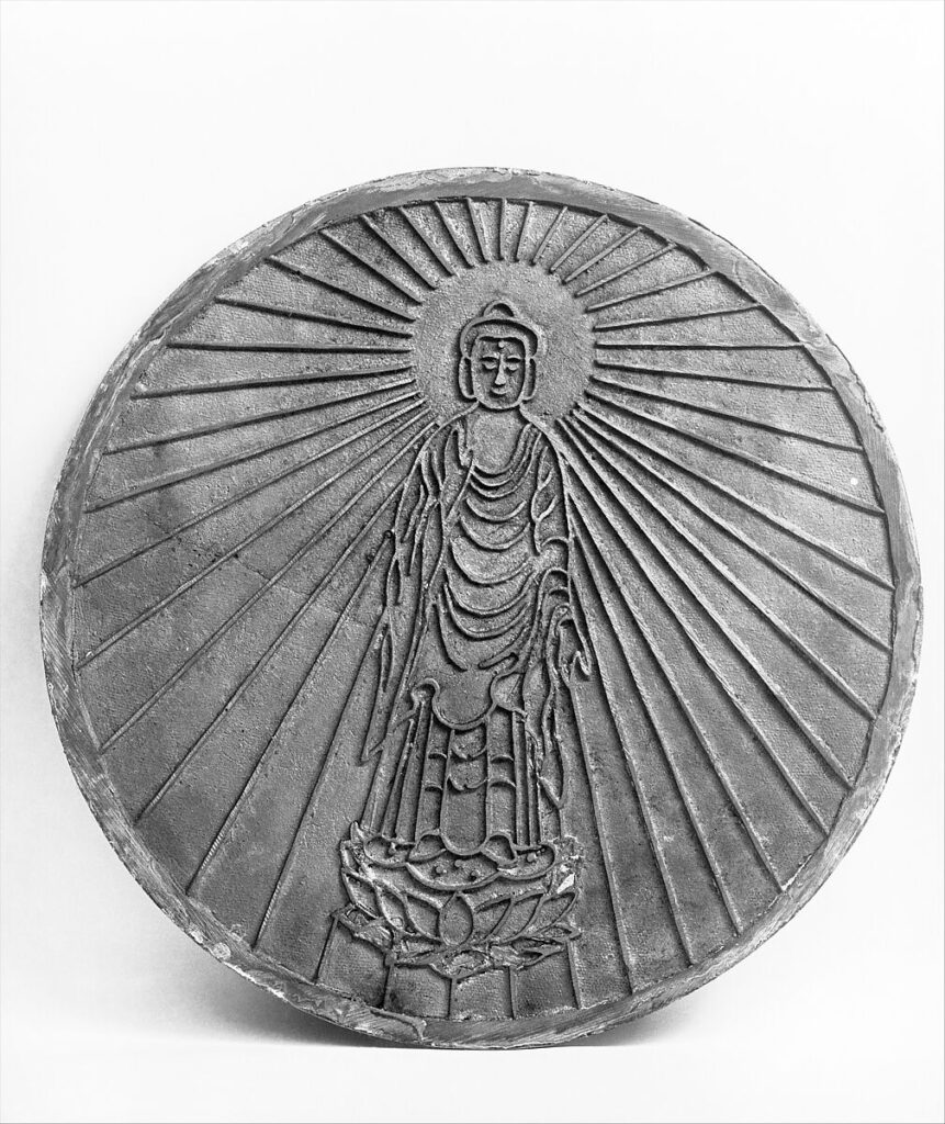
Han technique versus later Buddhist “magic mirrors”

Centuries after the Han, workshops in China and Japan produced religious mirrors that reveal sacred imagery — most famously the Amida Buddha — under specific lighting. In some of these, craftsmen inserted a second thin relief plate behind the polished face. The projected image is then a deliberate design choice rather than a happy outcome of finishing stress. Both traditions appear “magical,” yet the construction differs. Han “transparent” mirrors usually rely on a single plate, cast and finished with exquisite control; later Buddhist examples may use compound structures to stage a vision on demand.

Either way, the audience response is similar: light, image, surprise, devotion. A secular TLV grid leans toward cosmology and state order; an Amida projection pulls toward salvation and ritual. The optical principle remains consistent — surface curvature modulates reflected intensity — but the cultural scripts diverge.

What science has done with the problem

Modern imaging and surface metrology have treated these mirrors as laboratories in miniature. Interferometry, scanning profilometry, and high-resolution macrophotography map deviations in curvature across the face. The measurements show undulations tiny enough to escape casual view yet strong enough to steer a beam. Replication studies with bronze coupons confirm that differential scraping and selective polishing can engrave a “hidden” pattern into a nominally smooth surface. The old workshops didn’t need equations; they had recipes, hands, and time.

This research cascade has a second life. Techniques derived from “magic mirrors” now help engineers inspect mirror-polished wafers and optics. Under a divergent beam and at modest distances, minute slope errors become visible as bright and dark bands on a screen. An ancient amusement, reframed, becomes a diagnostic for modern manufacturing.

Materials, alloys, and workshop decisions

Chinese mirrors are usually copper-tin alloys with a little lead. Tin hardens the metal and raises reflectivity; lead improves castability and flow. Analyses of Han mirrors commonly show tin around 20 percent, give or take, with lead between a few percent and the low teens depending on piece and period. Too much tin and the face becomes brittle; too little and it lacks shine. The right mixture lets a polisher work the surface without tearing.

Beyond chemistry sits habit. Some workshops favoured thick rims to stabilise the disc. Others leaned into rich reliefs on the back with heavy bosses and bold bands. Tool marks on faces — yes, even on mirrors — can linger under magnification: sweeping arcs from scrapers, straight runs from stones. When several mirrors share identical quirks in relief and finishing, scholars group them as a workshop cluster, sometimes even suggesting individual hands.

Designs that matter: TLV, beasts, stars

The TLV scheme, named by modern scholars for its resemblance to the letters T, L, and V, covers many Han backs with a grid that frames the world: a square for earth inside a circle for heaven, gate-like bars, and a central boss that anchors both structure and string. The four directional beasts — Azure Dragon, White Tiger, Vermilion Bird, Black Tortoise — guard the quadrants and bind text to cosmology. Star mirrors echo sky maps in simplified form. Any of these can, under the right finishing and lighting, whisper their shapes into reflected light.

Inscriptions often promise long life, prosperity, and moral clarity. A mirror talks to its owner: keep righteousness; enjoy blessings; reflect and be reflected. The projection effect, when present, adds one more layer to that conversation — a reminder that hidden order, patiently worked, reveals itself only under the right light.

Western Han TLV mirror, Honolulu Museum of Art.
Western Han TLV mirror. A clear example of strong relief bands used in classic backs. CC0. Source: Wikimedia Commons / Honolulu Museum of Art.

Making the effect by hand: a plausible workshop recipe

Reconstructing a Han recipe is part detective story, part shop floor. Start with a robust back: bosses, ribs, and a well-defined central knob. Cast the disc slightly thicker than the target. Work the face to a shallow convex. Scrape until the lows whisper through — you can feel them rather than see them. Burnish with firm, even pressure, but spend a little longer over zones opposite tall back relief. Polish in broad arcs. Finish with a surface treatment that stresses the skin. Set the mirror aside and let metal creep do its slow work. When ready, test with a strong beam.

None of this needs supernatural knowledge. It demands repeatable pressure, a disciplined sequence, and feedback from light. A mirror that “writes” on the wall pays you back for that discipline. The image will be dim, but it will live.

Where to see them today

Major collections hold Han mirrors in depth. Some galleries pair backs with raking light so you can read relief clearly. Others show fronts under soft, even illumination. A few museums demonstrate projection with modern lighting rigs — carefully, briefly, and under controlled conditions. Even without the “magic,” the objects reward close looking: crisp inscriptions beside carefully chased lines; patinas ranging from deep black to green; tool marks caught at the edge of bosses; string scars around central knobs.

It helps to remember that these were held, tied, and used. Their intimacy shows in the way a thumb finds the same place under the rim. The small scale of most Han mirrors insists on closeness. You don’t stand back; you lean in. You see your face, the room behind you, and, if the staff allow it, the glancing shift in a beam that turns a blank patch of light into a grid.

Care, conservation, and safe viewing

Bronze is sturdy, but mirrors are thin. Warping, corrosion, and past treatments complicate matters. Conservators prefer stable humidity, modest light, and supports that let discs flex slightly. Cleaning is conservative. The goal is to preserve both patina and the microscopic surface that carries the optical effect. Demonstrations, when done, keep light levels safe and exposure short. If a mirror projects, staff document it fully so future researchers can replicate the setup.

Reproductions have their place. Modern replicas help explain the physics without risking a fragile original. A good replica can match alloy, thickness, and finishing sequence closely enough to make the effect behave on cue, which makes teaching easier and the real objects safer.

Why the story still thrills

Part of the appeal is the sheer neatness of the trick. Another part is the blend of head and hand. No theorem alone could design such an object in antiquity; no hand alone could stumble into it without patient testing. The Han workshop that produced a “transparent” mirror found a feedback loop between practice and effect and stayed with it long enough to make the result reliable. You can almost hear the pride in a master’s voice: Watch the wall.

There is also a moral hidden in the optics. A polished surface looks blank yet holds a map. Under the right light, that map appears. The idea feels very Han: order beneath gloss; structure beneath style; truth waiting for a steady hand and a clear beam.

Japanese Buddhist ‘magic mirror’ associated with Amida.
Later religious ‘magic mirror’ type that reveals an Amida image in projection. Public Domain. Source: The Metropolitan Museum of Art (Open Access) via Wikimedia Commons.

Reading one in person: a quick guide

Start with the back. Name the scheme: TLV, beasts, star, or inscription field. Check the rim for thickness and any rope wear around the knob. Note the alloy colour. Then turn to the face. Catch the curvature at the edge. Look for faint tool sweeps under raking light. If the gallery provides a diagram of the projection, study where the brightest domains align with back relief. If not, imagine the mapping: thick under thin, thin under thick, pressure echoing pattern across the disc.

Finally, allow the mirror to be a mirror. Stand at arm’s length and watch the room in its curve. The object doesn’t need the “magic” to matter. It has already done the real work: bringing craft, belief, and physics into an everyday thing you can hold by the knob and slip into a sleeve, two thousand years ago or today.

Han bronze mirror with rich back relief.
Han bronze mirror photographed in a museum setting; useful as a comparative back pattern. CC0. Source: Wikimedia Commons (Gary Todd).

Parthenon’s Lost Colours: Digital Rebuild Shows Bold Original

Stand beneath the Parthenon today and you see luminous marble, softened by time and light. That white is not the whole story. Ancient Athenians did not leave their most famous temple bare. They painted mouldings, triglyphs, metopes and sculpted figures with strong pigments that caught the sun. Recent scientific work and digital reconstructions have pushed this point from scholarly debate to vivid demonstration. The Parthenon was not pale. It was designed to glow.

What these reconstructions give us is not a carnival of guesswork, but a careful return to colour grounded in evidence. Portable instruments read microscopic traces in situ. Imaging techniques reveal pigments invisible to the eye. Once those clues are mapped, 3D models apply historically plausible palettes to the architecture and sculpture. The result is startling, yet rational. Lines we thought of as shadow become borders of blue. Patterns we barely noticed come forward in red and black. The building’s order tightens, and its symbolism reads more clearly from a distance.

What changed: from white-marble myth to a coloured reality

For centuries, the West admired classical ruins as studies in stone and light. That habit hid an ancient truth. Greek temples were built to be read, not merely admired. Colour guided the eye and marked out meaning. In the nineteenth century, a few scholars argued for ancient polychromy; modern conservation has turned suspicion into confirmation. On the Acropolis, researchers documented blue, red and other residues on architectural members. In the British Museum, imaging identified pigments on sculpture that once lined the cella.

Digital reconstructions do not replace the marble. They restore legibility. When a meander pattern along a cornice is tinted in its original blues, the movement of the design makes sense. When the sculpted figures of the frieze are given contrasting grounds, the procession becomes easier to follow. These reconstructions are models, open to revision, yet they already correct a long habit of viewing the Parthenon as a work of pure stone. Colour was part of the design language.

How scientists recover vanished paint

The work begins with the stone. Conservators and scientists take instruments up the scaffolds and examine surfaces under magnification. X-ray fluorescence identifies elements that hint at pigment families. Micro-Raman and FTIR spectroscopy provide molecular fingerprints. Visible-induced luminescence photography makes particles of Egyptian blue light up in the near-infrared, a party trick with serious value. Together, these methods tell you which colours were placed where, even when paint fragments are tiny or altered by weather.

Sampling is light-touch. The Parthenon is a global monument, so invasive work is kept to a minimum. Fortunately, a multi-technique approach often avoids the need to remove micro-samples at all. In several campaigns, teams recorded blue products along cornice blocks and decorative bands, reds in mouldings and details, and traces consistent with gilding on select areas. The picture is not complete, yet it is coherent enough to anchor reconstruction choices.

Which colours, and on which parts

Two blues do the heavy lifting in the surviving record: azurite and Egyptian blue. They were not interchangeable. Craftsmen used them for different zones and effects, sometimes side by side. Red appears as both ochre and, more rarely, the hotter cinnabar. Black gives definition in lines and patterns. Gold leaf or golden paint may have accented weapons, jewellery or border motifs in sculpture. No single scheme fits every block, because work proceeded over years and several hands. Still, patterns repeat: blue for the taenia bands and meanders; red for mutules and background fields; dark lines to sharpen relief.

Sculpture complicates the story. Relief figures would have stood out against coloured grounds. Hair, eyes, lips and textiles took specific tints. Shields and harness might have had gilded details. Look at the west frieze today and imagine riders suddenly pulling forward from a blue-green field, with reins and manes picked out. The procession breathes again when the background returns.

Nineteenth-century plate of a Doric entablature with painted mouldings.
Public-domain plate illustrating typical Doric polychromy on triglyphs, metopes and bands, analogous to Parthenon schemes. Source: Wikimedia Commons (public domain).

Why the palette makes structural sense

Colour on Greek architecture is not decoration for its own sake. It clarifies structure and strengthens rhythm. On a bright day, white marble can dissolve under glare. A painted taenia reads as a clean baseline for the cornice. Coloured mutules cast shadows that seem deeper and more regular. Patterned bands arrest the eye before it slides away. The designers used pigment like an architect uses shade and light, to keep a large composition legible from far away.

There is also an optical trick at work. Egyptian blue scatters light in ways that remain lively even when the particles are small. Under Attic sun, a blue meander along the cornice would have flickered softly as you moved. Reds warm the stone; darks pull edges into focus. Reintroduce those effects digitally and the building’s proportions appear tauter. The refinements that scholars admire—the subtle curvatures and the precision of alignments—do not vanish. Colour helps you see them.

From data to digital: how reconstructions are built

Reconstruction teams combine several ingredients. First, they compile pigment maps from the analytical campaigns. Second, they collect high-resolution scans of architectural blocks and sculptures. Third, they examine historical watercolours and early casts that preserve details now lost. Those streams feed a 3D model. In software, conservators apply materials that simulate waxy or mineral paint, test saturation under simulated daylight, and iterate until the outcome aligns with the evidence. Each release is documented, so later research can update a tone, a border or a motif without starting over.

Two further limits keep the work honest. Where evidence is secure, colour placement is firm. Where evidence is thin, reconstructions show options or leave areas neutral. This blend of certainty and restraint is one reason the newest models feel persuasive. They do not shout. They guide.

What the sculptures may have looked like

Imagine a metope scene, Lapith against centaur. The stone carving gives motion and force. Paint adds the final read: a coloured ground behind the figures; darker lines to sharpen muscles; touches of red for wounds; gleam on a bronze cup or bit. Relief becomes narrative. On the frieze, human and animal eyes find definition. Hair takes depth. The parade looks less like a cloud and more like a sequence of real bodies moving along a wall.

High-resolution image of a Parthenon frieze block with mounted riders.
Marble relief from the Parthenon frieze, ideal as a base for digital recolouring to restore the original painted background. Source: Wikimedia Commons.

Context from elsewhere: why other coloured sculptures matter

Some viewers hesitate when they see bright reconstructions. The tones feel modern to eyes trained on patinated stone. Comparanda help. Across Greek art, surviving paint and historical copies show that strong colour was the norm. Archaic statues wore patterned garments. Later pieces used subtler accents, but still relied on reds, blues and blacks to bring form into focus. When you study those cases, the Parthenon’s palette looks less like an exception and more like the best version of a wider habit.

Museum displays make this point well. Exhibitions that place a coloured replica next to an original give visitors a useful jolt. The white marble retains its quiet authority; the reconstruction explains how it once worked. You do not have to prefer one over the other. Seeing both together corrects the record.

Painted reconstruction of the Peplos Kore used to demonstrate ancient colour.
A well-known reconstruction that helps modern viewers calibrate what ancient colour could look like on sculpture. Source: Wikimedia Commons.

Inside the temple: Athena Parthenos and spectacle

The exterior was not the only place where colour mattered. Inside stood Athena Parthenos, a colossal figure of gold and ivory, surrounded by painted architecture and glittering fittings. Modern replicas help us picture the effect. Gilded surfaces caught torchlight; coloured details framed the goddess; polished marble reflected both. Even if we disagree on exact shades, the principle stands. The interior was staged for impact, not stripped for minimalism.

This matters for how we think about sacred space. Ancient worshippers moved through a choreography of colour, texture and scale. The brighter palette of a reconstruction may look unfamiliar to us, yet it is closer to the ancient experience than a cool, unpainted hall. Digital models that include interior lighting deepen this insight. They show how the statue rose from darkness, how gold leaf glowed, and how painted ceilings gathered the light overhead.

Gilded and painted replica of Athena Parthenos in the Nashville Parthenon.
A modern, open-licence photo showing how colour and gold could transform a temple interior. Source: Wikimedia Commons.

Why this research changes public history

Colour is a cultural signal. When we drain it from classical monuments, we risk flattening the past into a single taste. The Parthenon’s original scheme tells us that Athenians valued clarity, splendour and legibility. It suggests a city at ease with saturated surfaces and strong patterns. That evidence also punctures a modern myth that white marble equals purity. The ancients were more practical and more theatrical than that idea allows.

Digital reconstructions can travel far beyond the hill in Athens. A teacher can load a model in a classroom and let pupils orbit the building, change the light and explore how a blue band shifts under midday sun. A museum can run a projection that overlays colour on a cast, so visitors see the linework snap into focus. These tools do not end debate. They open it to more eyes.

Questions people ask

How bright were the colours really?

Evidence says brighter than many expect. Reds and blues read clearly even at distance. Saturation varied with pigment and binder, and exposure would have mellowed surfaces over time. Reconstructions show fresh paint under ideal light. Reality on the Acropolis would have ranged from newly vivid to softly weathered, depending on maintenance and season.

Is there a risk of overconfidence?

Yes. That is why good reconstructions mark degrees of certainty. Some borders and motifs are anchored by traces and tool marks. Others rest on analogy with better preserved members or related buildings. Teams publish their choices so critics can test them. The models are not final words; they are well-argued drafts.

What about gold?

Gilding and golden paint likely accented small details rather than large fields on the outside. Inside, gold and ivory dominated the cult statue. On the exterior, gold’s job was to catch sun on a wreath, a weapon or a patterned band, not to turn the whole building into a mirror.

Seeing the Parthenon anew

If you visit, try this: look at a cornice block and imagine the taenia band filled with alternating blues. Let the meander sharpen into view. Look at a metope, and picture a coloured ground behind the figures. Then step back to take in the whole façade and sense how colour anchors form. The monument does not need paint to be great. Yet colour restores a register of meaning that the stone alone cannot supply.

Digital reconstructions will keep changing as new evidence arrives. That is a strength, not a flaw. Each season adds a small proof, a pigment trace, a border line. When those crumbs are collected in a model, the building we thought we knew becomes richer, more legible, and closer to what fifth-century Athenians saw when they climbed the hill.

Pompeii’s Secret Erotica: Hidden Sexual Symbolism in Roman Wall Painting

Pompeii’s walls do not whisper about sex. They speak plainly. In dining rooms and shops, over doorways and in side chambers, images of desire, potency, and luck appear with a confidence that can surprise modern visitors. To the Romans, erotic imagery was not a taboo to hide behind curtains. It was a language. A phallus could bless a doorway. A bedroom scene could signal service in a brothel or simply play with myth. A god like Priapus could boast at the threshold and promise abundance within. Read this visual code and the city grows clearer, not cruder.

Much of that code is symbolic. A phallus is luck. A wreath hints at victory. A satyr and maenad mean wine and loosened rules. At other times, the message is literal. A small chamber off a side street shows a couple on a bed, and the context leaves little doubt about the room’s business. Yet even these scenes carried more than titillation. They signalled price, position, hierarchy, and humour in a very Roman way. Sex, in Pompeii, worked as commerce, ritual, and joke all at once.

Why explicit images stood at the door

Take the famous Priapus at the House of the Vettii. He weighs his phallus against a bag of money while fruit spills from a basket at his feet. It is a welcome and a boast. The household claims prosperity and asks the god to keep it flowing. Placing him at the entrance was not a prank; it was good sense. The image guards against envy, invites fertility, and lets guests know this is a house that enjoys plenty. It blends piety and performance with a wink that Roman visitors would recognise.

Across town similar signs appear on bakeries and workshops. A carved phallus over an oven promises luck for the day’s loaves. Another over a lintel promises the same for trade. Simple, bold, and effective, these symbols belong to the Roman habit of using images as apotropaic tools. A strong emblem deflects the evil eye. It turns attention into protection.

Erotic panels in the Lupanar

Pompeii’s best-known brothel, the Lupanar, still holds small paintings over the doors of tiny rooms. Each shows a couple on a bed. One scene leans tender; another, acrobatic. Scholars often describe them as a visual “menu”, a shorthand for services that transcended literacy. They also set a mood. Clients saw what the place offered before stepping into a cubiculum scarcely wider than an outstretched arm. The frankness is striking, yet the tone is tidy. Beds are made; sheets are drawn; the bodies are idealised. The panels state the business without grime.

Elsewhere, small side rooms in houses show scenes just as direct. Were these private spaces for pleasure, hired rooms, or jokes to amuse dinner guests. Context matters. A painting placed off a kitchen reads differently from one beside a courtyard. Archaeology studies the plaster joins, the floor levels, and the wear patterns to decide which is which. Even so, the line between entertainment and instruction remains thin. Romans liked to blur it.

Sex as symbol: the phallus as good luck

Not every erotic image is about sex. Many function as protection. The Romans called a phallic charm a fascinum. You find them in metal, in terracotta, and on walls, sometimes with small bells attached. People wore them. Shopkeepers hung them. Households placed them near thresholds. Laughter was part of the magic. A comically exaggerated charm made onlookers grin, and in that grin the evil eye lost its sting. In Pompeii, this kind of object is everywhere once you start to look.

Tintinnabula — little wind chimes hung with phallic forms and bells — served the same purpose. A rattle of sound and a flash of bawdy humour together fended off bad luck. Many were later gathered into the “Secret Cabinet” in Naples, a collection once opened by special request only. Today, they hang in well-lit galleries as evidence of a culture happy to meet misfortune with noise and nerve.

Bronze tintinnabulum with phallic forms from Pompeii, displayed in the Naples Archaeological Museum.
Tintinnabula combine sound and symbol. The flash of a comic phallus and a rattle of bells deflect the evil eye and invite good luck. Source: Wikimedia Commons.

Myth plays along

Roman painters often use myth to code desire. A satyr toys with a maenad. Dionysus finds Ariadne asleep and claims her as bride. Hermaphroditus startles a leering Silenus. These scenes decorate dining rooms and reception spaces, usually in the Fourth Style mix of architectural fantasy and cameo-like panels. They allow talk about pleasure, freedom, and danger without naming any guest. They also turn a dinner into a small theatre. The walls set the theme; the conversation does the rest.

Priapus, too, straddles symbol and story. In gardens he stands as guardian of vines and fruit trees. On walls he becomes a pun on wealth and virility. The House of the Vettii puts him front and centre in the vestibule. The message lands even if you skip the footnotes. Here is plenty. Here is power held lightly enough to joke about it.

Gender, power, and the Roman joke

Modern viewers sometimes read these images as simply male display. The story is more tangled. Women appear as patrons and sitters in domestic portraits; they also host scenes that set the tone for a feast. Brothel panels do objectify, yet the business model relied on the labour and presence of women and enslaved people whose lives the paintings rarely show. Meanwhile, the city’s graffiti records jokes, boasts, crude insults, and occasional tenderness in both male and female voices.

Roman humour liked reversal. A tiny figure carrying an absurdly outsized phallus pokes fun at bravado. A god who is both obscene and holy makes a point about the way power works. Laughter relaxes social rules for a moment and reveals who can bend them. The walls grin; the diners follow.

How painters built the scenes

Technically, these are frescoes. Artists spread fine plaster in sections and painted while the surface was still wet. Pigments bound into the lime, creating durable colour. In small erotic panels, the palette is tight: warm reds, ochres, carbon black, and quick white highlights. Figures sit on simple beds with crisp sheets and a red line to mark the edge. The economy suits the subject. A few strokes establish a thigh, a hand, a look over the shoulder. In larger mythological scenes, the brushwork loosens and the settings expand, yet the language remains economical and clear.

Some workshops built extensive programmes room by room. Floors, walls, and even ceiling motifs speak to each other. A tidy border frames the lively content. A painter who could model an eyelid with a single stroke earned good fees. When the painter’s hand appears in several houses, curators start talking about local “schools” or named masters. The city was a hive of such teams by the late first century.

Reading the rooms

Erotic imagery in a reception room does not turn the house into a brothel. It sets a tone for dining that welcomes frankness, wine, and witty speech. In sleeping chambers, small amorous scenes could bless the couple’s bed or simply echo fashionable taste. In brothels, painted panels at the door of each cubiculum help an anxious client choose. In shops, phallic signs work as good-luck charms and, sometimes, as playful advertisements. Context decides meaning. The same phallus that guards a bakery oven would feel out of place in a shrine to the household gods, unless the family liked a joke at the gods’ expense.

Street signs add another layer. A carving shaped like a phallus might point down a lane. Some guides claim these arrows led clients to brothels. That makes a neat story. It is not the only reading. Many such images simply mark good fortune, the presence of a successful shop, or the hope that envy will pass by without harm. The best answer, as often in archaeology, is “sometimes”.

The “Secret Cabinet” and changing taste

When the first great finds from Pompeii and Herculaneum reached Naples in the eighteenth and nineteenth centuries, curators quickly locked away objects that seemed indecent. Thus began the Gabinetto Segreto, a room within the Naples Archaeological Museum where erotica could be viewed by mature men who asked politely. Policies shifted with fashion and politics. Today the room is open, with warnings for families, and the scholarship is frank. What earlier generations saw as embarrassment, we now read as culture.

This history of display matters because it shaped early writing on Pompeii. For decades, elegant mythological panels were praised while erotic signs were ignored or hidden. The result was a distorted city, tasteful but unreal. Restoring the bawdy pieces to the story brings the place back to life. You cannot understand Roman humour, protection, or hospitality without them.

Commerce, status, and the erotic wall

Sex sold, of course, but it also signalled status. A house that could afford a full Fourth Style programme, with myth panels and ornament, could also afford a playful Priapus at the door. A bakery that carved a neat fascinum above the oven announced prosperity and invited more. Even brothels had image budgets. A run of small panels over the doors suggested management with pride in the premises. Painters translated these needs into crisp scenes that resisted soot, steam, and time.

Meanwhile, the city’s trade in images was lively. Workshops kept pattern books and reused compositions. Certain couples on a bed return again and again, with the angle tweaked or the sheet pulled differently. These were not television stills; they were efficient signals that said enough without fuss.

The moral weather of the house

Roman religion slid easily between temple and table. A household altar (a lararium) might show a snake of abundance beside the family’s guiding spirits. Nearby, a small erotic scene could mark fertility and joy, while a phallic charm guarded the door. No one saw tension here. The divine liked laughter and wine as much as sacrifice and incense. When Dionysian imagery fills a dining room, it invites guests to relax their tongues, sing, and let wit run swift.

These choices made the moral “weather” of the house. A prim set of panels might suit an older couple. A racier run could fit a host who liked to shock. Either way, visitors registered the room’s temperature at a glance.

What is symbol, what is sex

Modern viewers often ask for a firm line. Which images are pure symbol and which are porn. The line is blurry by design. Romans expected images to do several jobs at once. A phallus warded off harm and boasted of virility. A brothel scene informed and entertained. A myth panel flattered the host’s taste and set a theme for talk. Call them erotic if you like, but remember that meaning in Pompeii sits on several stools. Leave one out and the picture limps.

Even measurements can mislead. The famous Priapus is comically over-endowed. That is the joke. It is also the point. Abundance, not anatomy, is the subject. The money bag on the pan answers the scale. Fruit spills from a basket. The city gets the message in a heartbeat.

Technique and touch

In small panels the painter’s hand is the star. The contour of a shoulder rests on a single line, thickening as it turns under the arm. Shading on a thigh arrives as a soft haze of red-brown. Whites pop on the knuckles, the eye, the sheet edge. With so few strokes, the body comes together. That economy feels modern. It also explains why the paintings still look fresh. The fewer the moves, the fewer the failures.

Large myth panels bring a different pleasure. Here, tiny details reward time: a sandal’s strap, a grape’s highlight, a satyr’s grin drawn with the lightest touch. Painters understood that viewers would sit for hours at a meal. The wall must hold attention without draining it.

How to look without blushing

Start with the frame. Many panels sit inside painted architecture, with columns and friezes that pretend to be marble or gilt. That frame tells you to read the panel like a cameo. Next, clock the symbols. Laurels mean victory; grape vines mean wine; a phallus means luck and fertility. Then, let your eye meet the figures. When a panel sits over a tiny room with a masonry bed, you can guess the function. When it sits in a smart dining room, it may be teasing or mythic rather than literal.

If you bring children, pick your route. Many museums and sites now use discrete signage and give parents choices. The point is not to hide the past, but to meet it on your own terms.

Misreadings and careful corrections

Tidy stories travel fast. Not all survive scrutiny. The idea that every street phallus points to a brothel is one of them. Some surely did. Many did not. Similarly, not every erotic panel marks a sex worker’s room. Context, again, is king. Archaeology is patient, and the city rewards patience. Layer by layer, the rooms tell the truth.

When a claim feels too neat, check the details. Is the panel over a real bed or a plaster shelf. Is there a latrine nearby. Do lamp soot and floor wear match a busy venue or a tidy private space. Answers to such questions cool hot takes without killing curiosity.

Why this matters now

Pompeii’s erotic imagery is art history, yes, but it also sharpens how we think about symbols in public space. A culture may place the same image on a shrine, a shop, and a joke plaque without confusion. Meanings stack. Modern cities do this too, just with different emblems. Studying Pompeii helps us see that flexibility and resist easy binaries.

There is also comfort in honesty. The ancients admitted desire, fear, and luck into their daily decor. They built humour into protection and made space for frankness at dinner. You do not need to approve of every choice to admire the confidence. The walls said what the city meant.

Visiting today

The Archaeological Park of Pompeii presents these works with context and care. The House of the Vettii has reopened after long restoration, its walls gleaming, its priapic threshold intact. The Lupanar remains small and crowded, a reminder that commerce once fit into tight corners. Naples holds the famous “Secret Cabinet” with bronze charms and rude lamps. Signs warn; doors remain open. Scholars continue to refine labels as new studies appear. The result is a city easier to read each year.

Give yourself time with the images. Step close, then back away. Watch how a single white dot turns an eye alive. Notice how a sheet’s red edge holds the bed in place. Smile at a charm that made Romans laugh. In the end, the best response to Pompeii’s erotica is the one Romans planned: delight, tempered by good sense.

Priapus fresco at the House of the Vettii in Pompeii, showing the god weighing his phallus against a money bag.
Priapus greets visitors at the House of the Vettii, a bold image of fertility and prosperity placed right in the entrance. Source: Wikimedia Commons.

The long afterlife of a short joke

The phallic relief with the legend hic habitat felicitas — “happiness lives here” — has become a minor celebrity. It condenses the Roman habit of folding fortune, fertility, and humour into a single sign. You can read it as bravado, charm, or both. Bakers carved it near ovens. Shopkeepers set it by doors. The phrase survives because it is good copy: compact, cheerful, and just cheeky enough to keep envy away.

Nearby, bells tinkle from a tintinnabulum, and a small bronze amulet dangles from a necklace. Each item works the same magic. Turn the gaze. Make the watcher laugh. Convert malice into a grin. In a city that lived with risk, this strategy suited people who wanted to move on with their day.

Ethics of display and the family visit

Sites and museums face old questions in new ways. What do we show. How do we label it. Where do we warn. Recent practice trusts visitors and gives them choices. Clear signs mark rooms that contain explicit imagery. Guides explain symbolism without sniggering. Teachers use myth panels to discuss consent, power, and performance in ancient literature. The goal is not to sensationalise, but to restore balance. Sex is one thread in a larger fabric of daily life, faith, and trade.

Handled well, these objects teach agility. Viewers learn to hold two ideas at once: that an image can be frank and still function as ritual; that a joke can also be a prayer.

Bronze phallic amulets from the Naples Archaeological Museum, displayed as a group.
Bronze charms known as fascina appear in many sizes and forms. People wore them or hung them at doors to guard against envy and harm. Source: Wikimedia Commons.

Looking ahead

Conservation will keep refining the colours and lines we see today. As soot lifts, as salts retreat, as lost corners reappear, details sharpen. Scholars continue to probe workshop patterns, link portraits to owners, and test old claims. Fresh finds at the park bring new sparks to a long-running conversation about how Romans blended ritual, humour, and desire in public view.

For now, the city remains a rare place where you can test your eye against another culture’s confidence. The walls will not blush. You do not have to either. Read the symbols, enjoy the wit, and carry the lessons home.

Stone relief with phallus and the inscription “Hic habitat felicitas”.
“Happiness lives here.” A neat stone relief that blends ward, boast, and brand. Source: Wikimedia Commons (Naples Archaeological Museum).

Fayum Mummy Portraits: Hyper-Real Faces of Roman Egypt

Walk into a gallery that holds the Fayum mummy portraits and you meet people, not statues. Faces in three-quarter view. Pupils caught with bright points of light. Heads turned slightly, as if a conversation paused a heartbeat ago. These are images made in Roman Egypt, mostly between the first and third centuries CE, painted on wooden panels and set over the faces of the dead. They are also among the most direct encounters we have with antiquity: a moment when a painter’s hand tries to pin a living presence to a thin board of wood.

The label “Fayum” comes from the oasis south-west of Cairo, a region that yielded many examples, although similar portraits turn up across Roman-era Egypt. The style is Greco-Roman, the purpose is Egyptian, and the result is something singular: a merger of techniques and beliefs that still feels immediate. Museums prized them once they reached Europe in the nineteenth century, yet it has taken careful archaeology and modern science to explain how they were made, where they travelled, and why they endure.

What the portraits are, and what they are for

Each panel is a wooden support — often limewood or linden, sometimes cedar or cypress — covered with a white ground and painted in either hot wax (encaustic) or tempera. The portrait was attached to the mummy wrappings over the face. In life, it may have hung at home; in death, it kept vigil. This dual role matters. The painter’s job was not only to flatter or describe, but to secure identity for the journey after burial. Hence the attention to individual features: a beauty mark, a scar, a turned lip, a fashionable curl.

The dates vary by workshop and site, yet most belong to the first three centuries CE. Hairstyles help with chronology; so do jewellery types, clothing details, and the way the pupils and irises are painted. Portraits that look strikingly “modern” often sit in this window, when Roman taste favoured realism and a play of light across skin.

How they were made: wax, water, wood

Two techniques dominate. Encaustic mixes pigments with molten beeswax. Tempera binds pigments in water with animal glue or another protein. Both can be rich and precise, though they behave differently under the brush. Encaustic allows painterly, almost oily modelling; tempera builds thin, matte layers with crisp edges.

Encaustic: heat, sheen, and depth

In encaustic portraits the flesh glows. Artists worked warm wax with brushes and heated tools, pushing and fusing strokes into soft transitions. Highlights could be literally raised — a ridge of wax catching light on the cheek or eyelid. Reds from ochres and madder lakes, blacks from carbon, and lead white play across faces. Gold leaf sometimes brightened wreaths or backgrounds, particularly in portraits of the fashionable or well-to-do.

Tempera: speed, clarity, and line

Tempera portraits read as cooler and flatter, with delicate hatching and sharply drawn contours. Because the medium dries quickly, painters laid down decisive strokes, especially around eyes and hair. Seen close, the brushwork maps the painter’s order of operations: pupils, then irises; lashes last; hair in small, direction-aware lines.

Faces in context: life, status, and fashion

These were not royal images. They belonged to people from towns and villages who could afford a panel and a skilled hand. Many sitters carry Greek names; some have Egyptian names rendered in Greek. Clothing and jewellery mirror Roman taste: cloaks with purple clavi, wreaths of gilded leaves, earrings with pearls. Hairstyles track imperial fashion with surprising accuracy, giving curators a way to bracket dates. A woman’s piled curls or a man’s beard length can narrow a portrait to a span of decades.

Age and expression vary. Infants peer solemnly, teenagers look composed, elders gaze with a heavy calm. A few carry inscriptions. One famous panel names a boy called Eutyches; others add scraps of information that suggest status or origin. None of it feels generic. Even when a workshop repeats a formula — a favourite pose, a standard necklace — the painter shifts features to keep the person before them intact.

Met Museum ‘Portrait of the Boy Eutyches’, encaustic panel, AD 100–150.
A named sitter from Roman Egypt, painted in encaustic with vivid catchlights and Greek inscription. Public Domain. Source: The Metropolitan Museum of Art (Open Access).

Workshops and working methods

Evidence points to local workshops serving nearby communities. Painters reused panel sizes and proportions; carpenters prepared boards with standard thicknesses. Tool marks on the reverse, saw kerfs, and dowel holes suggest patterns in manufacture. Painters probably kept design habits: where to place the highlight in the iris, how to build a curl, which brown to use for hair underpainting. When several portraits share the same quirks, curators propose hands or “masters” at work in a single shop.

There is also proof of collaboration. Goldsmiths handled leaf and ornament; carpenters cut frames; embalmers stitched panels into wrappings. A portrait might begin in a studio and end in a funerary space, with last touches added after the body was bound — for example, gilded borders applied once the panel sat flush with the wrappings.

What science has added

The past decade has transformed the technical study of these panels. Museum scientists now use imaging and spectroscopy to map pigments, binders, and even trace resins. A collaborative network, focused on ancient panel paintings, has pooled results so that a portrait in New York can be compared with one in London or Los Angeles. This has clarified what the eye already suspects: different workshops developed distinct recipes, and painters freely switched between encaustic and tempera depending on cost, fashion, or training.

One discovery gets particular attention. A synthetic pigment called Egyptian blue, known from pharaonic art, shows up in these portraits in small, strategic doses. Under visible-induced luminescence imaging, it glows in the near-infrared, revealing where artists used tiny particles to cool shadows or give life to veins and eyelids. The effect is invisible in normal light, yet it shapes the look. That trick — a whisper of blue in the flesh — helps explain why the skin reads as convincing rather than flat.

Wood, wax, and time

Analyses of the support confirm what object labels often note: lime/linden is common, with occasional cedar, cypress, or sycamore fig. Dendrological study is rare because panels are thin, but species ID by microscopy is robust. Wax composition mostly points to beeswax; tempera binders show animal glue. Coatings applied in later centuries sometimes complicate the surface; conservators now characterise and, where safe, reduce those layers so the original paint can breathe again.

From excavation to gallery wall

The modern story begins with nineteenth-century digs and dealers. Systematic excavations at cemeteries in the Fayum brought the first large groups to light in the 1880s and again in the early years of the twentieth century. Some panels remained attached to mummies; others were removed and sold. Early handling could be rough by today’s standards, but it created the first catalogues and exhibitions that introduced the portraits to the public. Since then, major museums have acquired strong groups, and research has accelerated through loans and collaborative projects.

That history also leaves us with duties. Provenance research is active. Conservation ethics have matured. Museums now share technical data and images under open licences when possible. The more that records from past seasons and dealers are digitised, the better our picture of where a panel came from and how it moved.

Met Museum encaustic portrait of a young woman in red with gilded wreath.
Encaustic portrait with gilded wreath and rich modelling, typical of early 2nd-century style. Public Domain. Source: The Metropolitan Museum of Art (Open Access).

Reading a portrait: clues at a glance

Stand in front of one and try a checklist. Look at the eyes: many show a large iris and deep pupil with a bright, offset highlight. That catchlight anchors the gaze. Study the mouth: a slight asymmetry keeps it lifelike. Trace the hair: encaustic strokes can sit proud of the surface, while tempera strands stay flat and linear. Notice jewellery: a gilded wreath or pearl drop earring may point to Roman fashions from a particular reign. Follow the garment lines: a narrow purple clavus signals rank and Roman taste.

Then step back. The realism is not photographic. It is interpretive, designed to capture a presence. Painters build illusion from a short list of moves — highlight, shadow, contour, gloss — and it works because the choices are economical and confident.

Why they matter now

Art historians prize these panels because they preserve Greco-Roman painting where so little else survives. Archaeologists value them because they document a local society navigating empire, language, and belief. Conservators like them because they test technique. For the rest of us, the attraction is simpler. You meet someone’s eyes across two millennia and feel, briefly, that the distance is smaller than the date suggests.

There is also a lesson about cultural mixture. The portraits fuse imported style and native ritual without awkwardness. A Roman necklace sits comfortably on an Egyptian afterlife. The combination is not a compromise; it is a solution to living in a complex world.

Where to see them

Strong groups live in London, New York, Los Angeles, and other cities. Some museums display panels beside wrapped bodies to restore context; others gather them in quiet rooms where you can study brushwork at nose length. More institutions now release high-resolution images with open licences, which helps scholars and publishers — and makes it easier for readers to see details at home.

Mummy of Herakleides with the panel portrait still in place on the wrappings.
A rare example with the portrait attached to the wrappings, showing how panels were used at burial. Public-domain photo via Wikimedia Commons; object at the J. Paul Getty Museum.

How to read them with care

Because many portraits were removed from mummies long ago, context can be patchy. Dates sometimes rely on style more than excavation records. That is why technical projects matter: wood species, tool marks, and pigment choices can link scattered panels back to workshops and regions. When a group of portraits shares identical board widths, saw marks, and paint mixtures, you can start to rebuild a community of makers and patrons.

Meanwhile, display matters. A portrait hung as a painting on a wall reads one way; set into linen wrappings, it reads another. Museums that show both views help visitors understand the ritual role without losing the intimacy of the face-to-face encounter.

Walters Art Museum tempera/encaustic mummy portrait of a bearded man.
Panel portrait from Roman Egypt, showing matte finish and crisp line typical of tempera-leaning technique. Public Domain. Source: Walters Art Museum via Wikimedia Commons.

A note on care and conservation

Panel portraits are fragile. Wood moves with humidity; wax softens with heat; protein binders dislike damp. Modern mounting systems allow the boards to flex gently. Conservators keep light levels modest and temperatures steady. When older varnishes or restorations cloud the surface, careful cleaning can recover the original clarity of the skin tones and the sparkle in jewellery.

Imaging has become non-invasive and revealing. Multispectral photographs isolate pigments; X-rays map nails and joins; reflectance shows underdrawing. Sometimes the tests find Egyptian blue in places the eye would never expect, tucked into shadows or mixed into flesh. Small findings like that add up to larger insights into how painters built lifelike faces with very simple means.

Seeing them well

If you visit, give each panel time. Move sideways to watch the catchlights shift. Step back to see how the head turns into space. Look for the tiny asymmetries that break symmetry and make a face breathe. Then, read the label for the workshop’s date and the medium. When you leave the room, you will likely remember an expression rather than a name. That is as the makers intended.