Parthenon’s Lost Colours: Digital Rebuild Shows Bold Original

Stand beneath the Parthenon today and you see luminous marble, softened by time and light. That white is not the whole story. Ancient Athenians did not leave their most famous temple bare. They painted mouldings, triglyphs, metopes and sculpted figures with strong pigments that caught the sun. Recent scientific work and digital reconstructions have pushed this point from scholarly debate to vivid demonstration. The Parthenon was not pale. It was designed to glow.

What these reconstructions give us is not a carnival of guesswork, but a careful return to colour grounded in evidence. Portable instruments read microscopic traces in situ. Imaging techniques reveal pigments invisible to the eye. Once those clues are mapped, 3D models apply historically plausible palettes to the architecture and sculpture. The result is startling, yet rational. Lines we thought of as shadow become borders of blue. Patterns we barely noticed come forward in red and black. The building’s order tightens, and its symbolism reads more clearly from a distance.

What changed: from white-marble myth to a coloured reality

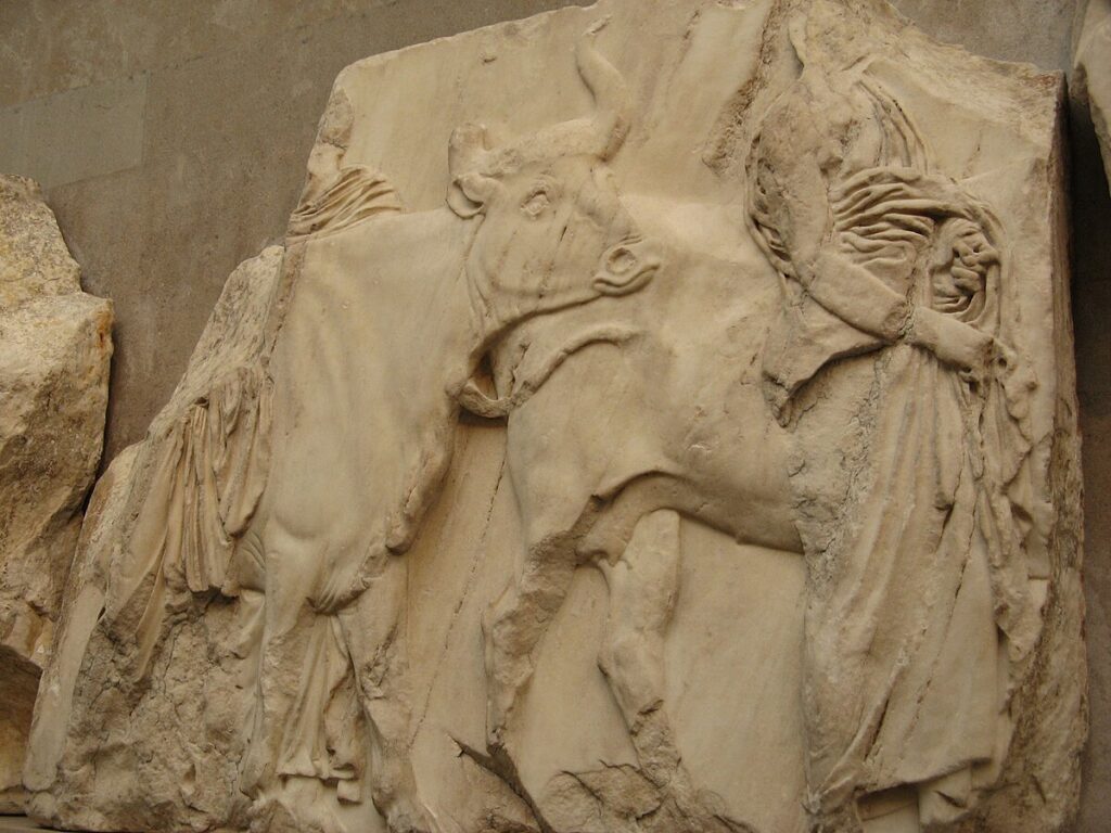
For centuries, the West admired classical ruins as studies in stone and light. That habit hid an ancient truth. Greek temples were built to be read, not merely admired. Colour guided the eye and marked out meaning. In the nineteenth century, a few scholars argued for ancient polychromy; modern conservation has turned suspicion into confirmation. On the Acropolis, researchers documented blue, red and other residues on architectural members. In the British Museum, imaging identified pigments on sculpture that once lined the cella.

Digital reconstructions do not replace the marble. They restore legibility. When a meander pattern along a cornice is tinted in its original blues, the movement of the design makes sense. When the sculpted figures of the frieze are given contrasting grounds, the procession becomes easier to follow. These reconstructions are models, open to revision, yet they already correct a long habit of viewing the Parthenon as a work of pure stone. Colour was part of the design language.

How scientists recover vanished paint

The work begins with the stone. Conservators and scientists take instruments up the scaffolds and examine surfaces under magnification. X-ray fluorescence identifies elements that hint at pigment families. Micro-Raman and FTIR spectroscopy provide molecular fingerprints. Visible-induced luminescence photography makes particles of Egyptian blue light up in the near-infrared, a party trick with serious value. Together, these methods tell you which colours were placed where, even when paint fragments are tiny or altered by weather.

Sampling is light-touch. The Parthenon is a global monument, so invasive work is kept to a minimum. Fortunately, a multi-technique approach often avoids the need to remove micro-samples at all. In several campaigns, teams recorded blue products along cornice blocks and decorative bands, reds in mouldings and details, and traces consistent with gilding on select areas. The picture is not complete, yet it is coherent enough to anchor reconstruction choices.

Which colours, and on which parts

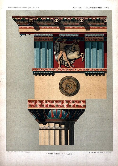
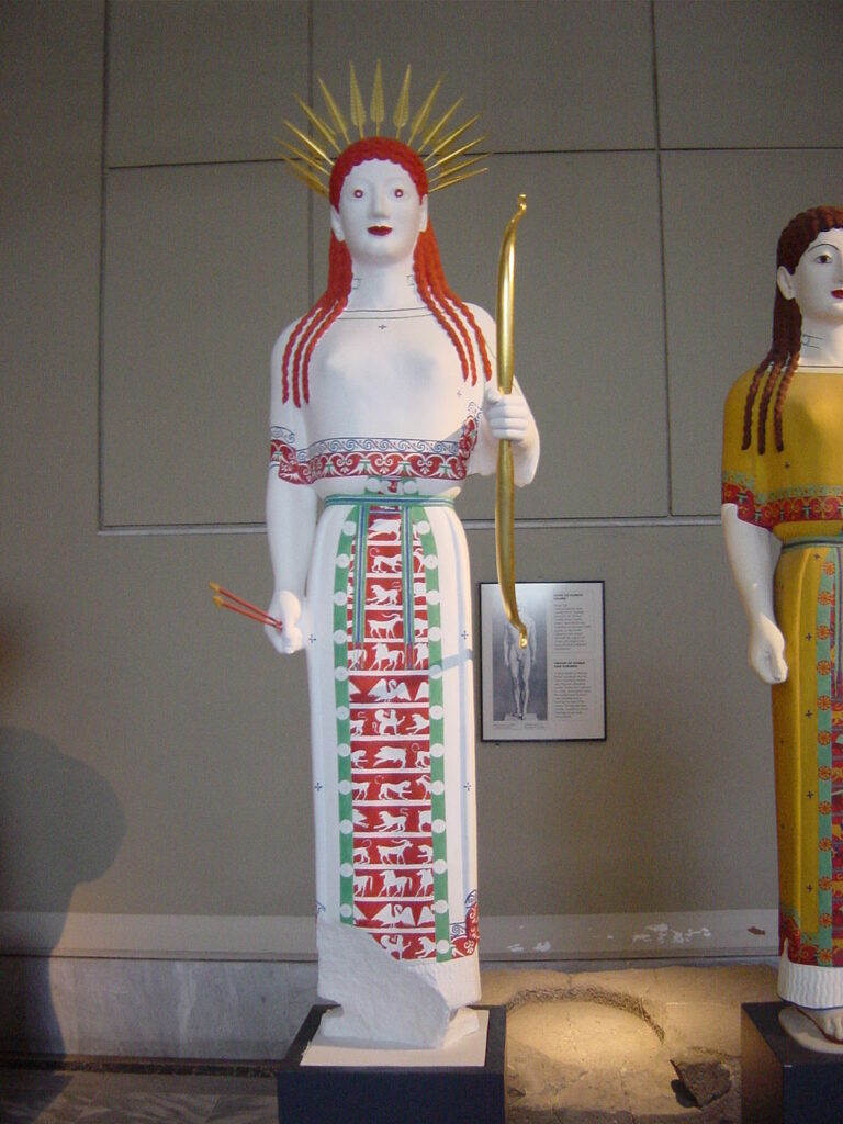
Two blues do the heavy lifting in the surviving record: azurite and Egyptian blue. They were not interchangeable. Craftsmen used them for different zones and effects, sometimes side by side. Red appears as both ochre and, more rarely, the hotter cinnabar. Black gives definition in lines and patterns. Gold leaf or golden paint may have accented weapons, jewellery or border motifs in sculpture. No single scheme fits every block, because work proceeded over years and several hands. Still, patterns repeat: blue for the taenia bands and meanders; red for mutules and background fields; dark lines to sharpen relief.

Sculpture complicates the story. Relief figures would have stood out against coloured grounds. Hair, eyes, lips and textiles took specific tints. Shields and harness might have had gilded details. Look at the west frieze today and imagine riders suddenly pulling forward from a blue-green field, with reins and manes picked out. The procession breathes again when the background returns.

Nineteenth-century plate of a Doric entablature with painted mouldings.
Public-domain plate illustrating typical Doric polychromy on triglyphs, metopes and bands, analogous to Parthenon schemes. Source: Wikimedia Commons (public domain).

Why the palette makes structural sense

Colour on Greek architecture is not decoration for its own sake. It clarifies structure and strengthens rhythm. On a bright day, white marble can dissolve under glare. A painted taenia reads as a clean baseline for the cornice. Coloured mutules cast shadows that seem deeper and more regular. Patterned bands arrest the eye before it slides away. The designers used pigment like an architect uses shade and light, to keep a large composition legible from far away.

There is also an optical trick at work. Egyptian blue scatters light in ways that remain lively even when the particles are small. Under Attic sun, a blue meander along the cornice would have flickered softly as you moved. Reds warm the stone; darks pull edges into focus. Reintroduce those effects digitally and the building’s proportions appear tauter. The refinements that scholars admire—the subtle curvatures and the precision of alignments—do not vanish. Colour helps you see them.

From data to digital: how reconstructions are built

Reconstruction teams combine several ingredients. First, they compile pigment maps from the analytical campaigns. Second, they collect high-resolution scans of architectural blocks and sculptures. Third, they examine historical watercolours and early casts that preserve details now lost. Those streams feed a 3D model. In software, conservators apply materials that simulate waxy or mineral paint, test saturation under simulated daylight, and iterate until the outcome aligns with the evidence. Each release is documented, so later research can update a tone, a border or a motif without starting over.

Two further limits keep the work honest. Where evidence is secure, colour placement is firm. Where evidence is thin, reconstructions show options or leave areas neutral. This blend of certainty and restraint is one reason the newest models feel persuasive. They do not shout. They guide.

What the sculptures may have looked like

Imagine a metope scene, Lapith against centaur. The stone carving gives motion and force. Paint adds the final read: a coloured ground behind the figures; darker lines to sharpen muscles; touches of red for wounds; gleam on a bronze cup or bit. Relief becomes narrative. On the frieze, human and animal eyes find definition. Hair takes depth. The parade looks less like a cloud and more like a sequence of real bodies moving along a wall.

High-resolution image of a Parthenon frieze block with mounted riders.
Marble relief from the Parthenon frieze, ideal as a base for digital recolouring to restore the original painted background. Source: Wikimedia Commons.

Context from elsewhere: why other coloured sculptures matter

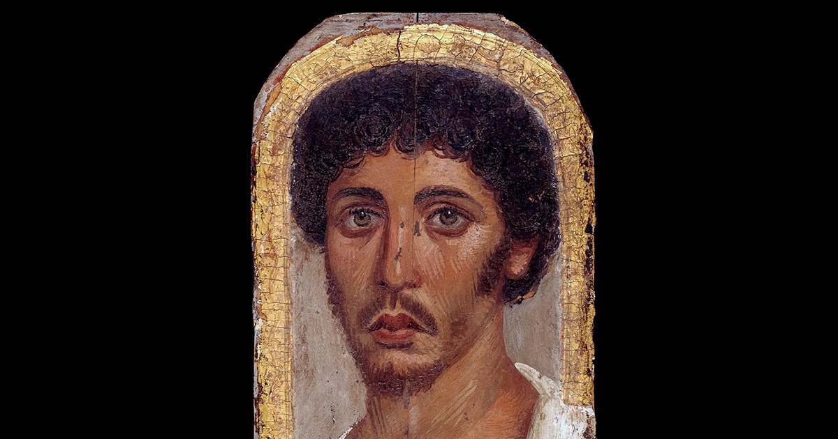
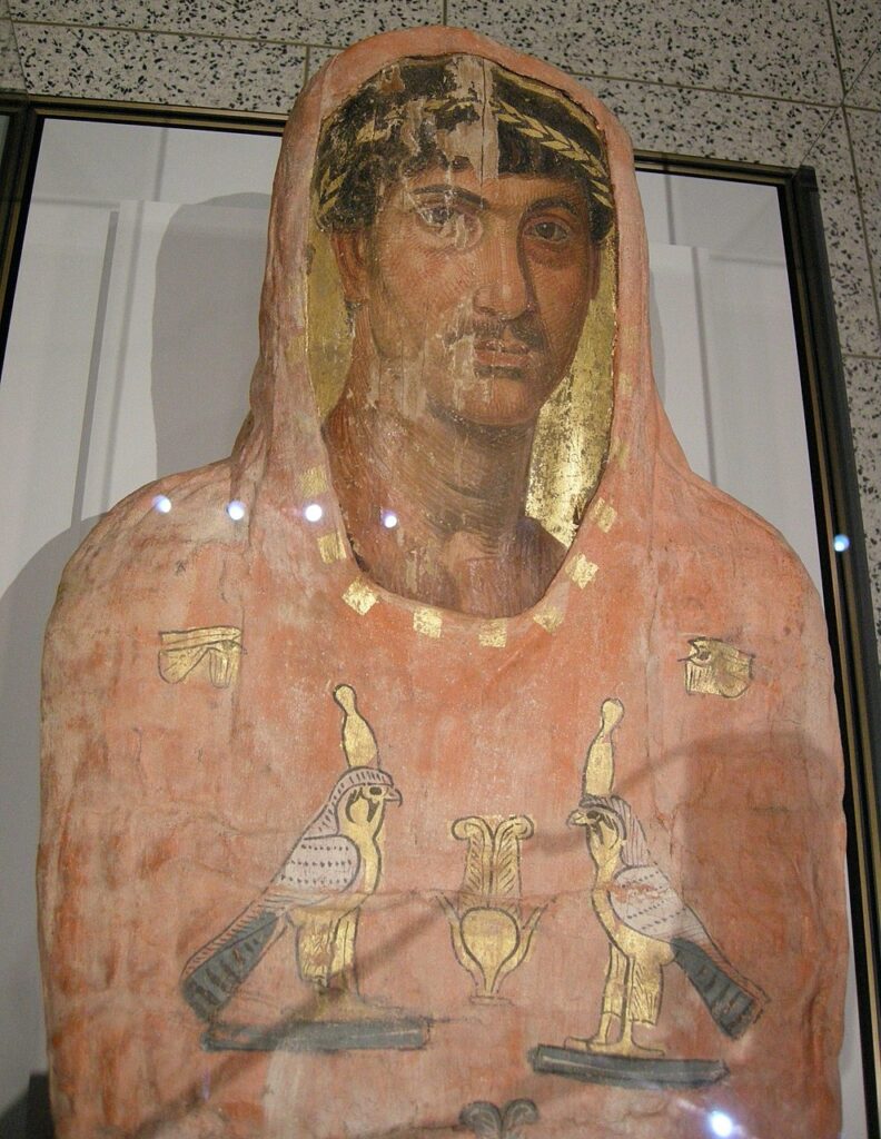
Some viewers hesitate when they see bright reconstructions. The tones feel modern to eyes trained on patinated stone. Comparanda help. Across Greek art, surviving paint and historical copies show that strong colour was the norm. Archaic statues wore patterned garments. Later pieces used subtler accents, but still relied on reds, blues and blacks to bring form into focus. When you study those cases, the Parthenon’s palette looks less like an exception and more like the best version of a wider habit.

Museum displays make this point well. Exhibitions that place a coloured replica next to an original give visitors a useful jolt. The white marble retains its quiet authority; the reconstruction explains how it once worked. You do not have to prefer one over the other. Seeing both together corrects the record.

Painted reconstruction of the Peplos Kore used to demonstrate ancient colour.
A well-known reconstruction that helps modern viewers calibrate what ancient colour could look like on sculpture. Source: Wikimedia Commons.

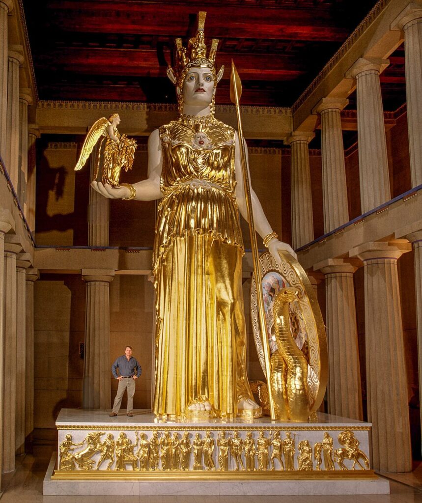
Inside the temple: Athena Parthenos and spectacle

The exterior was not the only place where colour mattered. Inside stood Athena Parthenos, a colossal figure of gold and ivory, surrounded by painted architecture and glittering fittings. Modern replicas help us picture the effect. Gilded surfaces caught torchlight; coloured details framed the goddess; polished marble reflected both. Even if we disagree on exact shades, the principle stands. The interior was staged for impact, not stripped for minimalism.

This matters for how we think about sacred space. Ancient worshippers moved through a choreography of colour, texture and scale. The brighter palette of a reconstruction may look unfamiliar to us, yet it is closer to the ancient experience than a cool, unpainted hall. Digital models that include interior lighting deepen this insight. They show how the statue rose from darkness, how gold leaf glowed, and how painted ceilings gathered the light overhead.

Gilded and painted replica of Athena Parthenos in the Nashville Parthenon.
A modern, open-licence photo showing how colour and gold could transform a temple interior. Source: Wikimedia Commons.

Why this research changes public history

Colour is a cultural signal. When we drain it from classical monuments, we risk flattening the past into a single taste. The Parthenon’s original scheme tells us that Athenians valued clarity, splendour and legibility. It suggests a city at ease with saturated surfaces and strong patterns. That evidence also punctures a modern myth that white marble equals purity. The ancients were more practical and more theatrical than that idea allows.

Digital reconstructions can travel far beyond the hill in Athens. A teacher can load a model in a classroom and let pupils orbit the building, change the light and explore how a blue band shifts under midday sun. A museum can run a projection that overlays colour on a cast, so visitors see the linework snap into focus. These tools do not end debate. They open it to more eyes.

Questions people ask

How bright were the colours really?

Evidence says brighter than many expect. Reds and blues read clearly even at distance. Saturation varied with pigment and binder, and exposure would have mellowed surfaces over time. Reconstructions show fresh paint under ideal light. Reality on the Acropolis would have ranged from newly vivid to softly weathered, depending on maintenance and season.

Is there a risk of overconfidence?

Yes. That is why good reconstructions mark degrees of certainty. Some borders and motifs are anchored by traces and tool marks. Others rest on analogy with better preserved members or related buildings. Teams publish their choices so critics can test them. The models are not final words; they are well-argued drafts.

What about gold?

Gilding and golden paint likely accented small details rather than large fields on the outside. Inside, gold and ivory dominated the cult statue. On the exterior, gold’s job was to catch sun on a wreath, a weapon or a patterned band, not to turn the whole building into a mirror.

Seeing the Parthenon anew

If you visit, try this: look at a cornice block and imagine the taenia band filled with alternating blues. Let the meander sharpen into view. Look at a metope, and picture a coloured ground behind the figures. Then step back to take in the whole façade and sense how colour anchors form. The monument does not need paint to be great. Yet colour restores a register of meaning that the stone alone cannot supply.

Digital reconstructions will keep changing as new evidence arrives. That is a strength, not a flaw. Each season adds a small proof, a pigment trace, a border line. When those crumbs are collected in a model, the building we thought we knew becomes richer, more legible, and closer to what fifth-century Athenians saw when they climbed the hill.

Fayum Mummy Portraits: Hyper-Real Faces of Roman Egypt

Walk into a gallery that holds the Fayum mummy portraits and you meet people, not statues. Faces in three-quarter view. Pupils caught with bright points of light. Heads turned slightly, as if a conversation paused a heartbeat ago. These are images made in Roman Egypt, mostly between the first and third centuries CE, painted on wooden panels and set over the faces of the dead. They are also among the most direct encounters we have with antiquity: a moment when a painter’s hand tries to pin a living presence to a thin board of wood.

The label “Fayum” comes from the oasis south-west of Cairo, a region that yielded many examples, although similar portraits turn up across Roman-era Egypt. The style is Greco-Roman, the purpose is Egyptian, and the result is something singular: a merger of techniques and beliefs that still feels immediate. Museums prized them once they reached Europe in the nineteenth century, yet it has taken careful archaeology and modern science to explain how they were made, where they travelled, and why they endure.

What the portraits are, and what they are for

Each panel is a wooden support — often limewood or linden, sometimes cedar or cypress — covered with a white ground and painted in either hot wax (encaustic) or tempera. The portrait was attached to the mummy wrappings over the face. In life, it may have hung at home; in death, it kept vigil. This dual role matters. The painter’s job was not only to flatter or describe, but to secure identity for the journey after burial. Hence the attention to individual features: a beauty mark, a scar, a turned lip, a fashionable curl.

The dates vary by workshop and site, yet most belong to the first three centuries CE. Hairstyles help with chronology; so do jewellery types, clothing details, and the way the pupils and irises are painted. Portraits that look strikingly “modern” often sit in this window, when Roman taste favoured realism and a play of light across skin.

How they were made: wax, water, wood

Two techniques dominate. Encaustic mixes pigments with molten beeswax. Tempera binds pigments in water with animal glue or another protein. Both can be rich and precise, though they behave differently under the brush. Encaustic allows painterly, almost oily modelling; tempera builds thin, matte layers with crisp edges.

Encaustic: heat, sheen, and depth

In encaustic portraits the flesh glows. Artists worked warm wax with brushes and heated tools, pushing and fusing strokes into soft transitions. Highlights could be literally raised — a ridge of wax catching light on the cheek or eyelid. Reds from ochres and madder lakes, blacks from carbon, and lead white play across faces. Gold leaf sometimes brightened wreaths or backgrounds, particularly in portraits of the fashionable or well-to-do.

Tempera: speed, clarity, and line

Tempera portraits read as cooler and flatter, with delicate hatching and sharply drawn contours. Because the medium dries quickly, painters laid down decisive strokes, especially around eyes and hair. Seen close, the brushwork maps the painter’s order of operations: pupils, then irises; lashes last; hair in small, direction-aware lines.

Faces in context: life, status, and fashion

These were not royal images. They belonged to people from towns and villages who could afford a panel and a skilled hand. Many sitters carry Greek names; some have Egyptian names rendered in Greek. Clothing and jewellery mirror Roman taste: cloaks with purple clavi, wreaths of gilded leaves, earrings with pearls. Hairstyles track imperial fashion with surprising accuracy, giving curators a way to bracket dates. A woman’s piled curls or a man’s beard length can narrow a portrait to a span of decades.

Age and expression vary. Infants peer solemnly, teenagers look composed, elders gaze with a heavy calm. A few carry inscriptions. One famous panel names a boy called Eutyches; others add scraps of information that suggest status or origin. None of it feels generic. Even when a workshop repeats a formula — a favourite pose, a standard necklace — the painter shifts features to keep the person before them intact.

Met Museum ‘Portrait of the Boy Eutyches’, encaustic panel, AD 100–150.
A named sitter from Roman Egypt, painted in encaustic with vivid catchlights and Greek inscription. Public Domain. Source: The Metropolitan Museum of Art (Open Access).

Workshops and working methods

Evidence points to local workshops serving nearby communities. Painters reused panel sizes and proportions; carpenters prepared boards with standard thicknesses. Tool marks on the reverse, saw kerfs, and dowel holes suggest patterns in manufacture. Painters probably kept design habits: where to place the highlight in the iris, how to build a curl, which brown to use for hair underpainting. When several portraits share the same quirks, curators propose hands or “masters” at work in a single shop.

There is also proof of collaboration. Goldsmiths handled leaf and ornament; carpenters cut frames; embalmers stitched panels into wrappings. A portrait might begin in a studio and end in a funerary space, with last touches added after the body was bound — for example, gilded borders applied once the panel sat flush with the wrappings.

What science has added

The past decade has transformed the technical study of these panels. Museum scientists now use imaging and spectroscopy to map pigments, binders, and even trace resins. A collaborative network, focused on ancient panel paintings, has pooled results so that a portrait in New York can be compared with one in London or Los Angeles. This has clarified what the eye already suspects: different workshops developed distinct recipes, and painters freely switched between encaustic and tempera depending on cost, fashion, or training.

One discovery gets particular attention. A synthetic pigment called Egyptian blue, known from pharaonic art, shows up in these portraits in small, strategic doses. Under visible-induced luminescence imaging, it glows in the near-infrared, revealing where artists used tiny particles to cool shadows or give life to veins and eyelids. The effect is invisible in normal light, yet it shapes the look. That trick — a whisper of blue in the flesh — helps explain why the skin reads as convincing rather than flat.

Wood, wax, and time

Analyses of the support confirm what object labels often note: lime/linden is common, with occasional cedar, cypress, or sycamore fig. Dendrological study is rare because panels are thin, but species ID by microscopy is robust. Wax composition mostly points to beeswax; tempera binders show animal glue. Coatings applied in later centuries sometimes complicate the surface; conservators now characterise and, where safe, reduce those layers so the original paint can breathe again.

From excavation to gallery wall

The modern story begins with nineteenth-century digs and dealers. Systematic excavations at cemeteries in the Fayum brought the first large groups to light in the 1880s and again in the early years of the twentieth century. Some panels remained attached to mummies; others were removed and sold. Early handling could be rough by today’s standards, but it created the first catalogues and exhibitions that introduced the portraits to the public. Since then, major museums have acquired strong groups, and research has accelerated through loans and collaborative projects.

That history also leaves us with duties. Provenance research is active. Conservation ethics have matured. Museums now share technical data and images under open licences when possible. The more that records from past seasons and dealers are digitised, the better our picture of where a panel came from and how it moved.

Met Museum encaustic portrait of a young woman in red with gilded wreath.
Encaustic portrait with gilded wreath and rich modelling, typical of early 2nd-century style. Public Domain. Source: The Metropolitan Museum of Art (Open Access).

Reading a portrait: clues at a glance

Stand in front of one and try a checklist. Look at the eyes: many show a large iris and deep pupil with a bright, offset highlight. That catchlight anchors the gaze. Study the mouth: a slight asymmetry keeps it lifelike. Trace the hair: encaustic strokes can sit proud of the surface, while tempera strands stay flat and linear. Notice jewellery: a gilded wreath or pearl drop earring may point to Roman fashions from a particular reign. Follow the garment lines: a narrow purple clavus signals rank and Roman taste.

Then step back. The realism is not photographic. It is interpretive, designed to capture a presence. Painters build illusion from a short list of moves — highlight, shadow, contour, gloss — and it works because the choices are economical and confident.

Why they matter now

Art historians prize these panels because they preserve Greco-Roman painting where so little else survives. Archaeologists value them because they document a local society navigating empire, language, and belief. Conservators like them because they test technique. For the rest of us, the attraction is simpler. You meet someone’s eyes across two millennia and feel, briefly, that the distance is smaller than the date suggests.

There is also a lesson about cultural mixture. The portraits fuse imported style and native ritual without awkwardness. A Roman necklace sits comfortably on an Egyptian afterlife. The combination is not a compromise; it is a solution to living in a complex world.

Where to see them

Strong groups live in London, New York, Los Angeles, and other cities. Some museums display panels beside wrapped bodies to restore context; others gather them in quiet rooms where you can study brushwork at nose length. More institutions now release high-resolution images with open licences, which helps scholars and publishers — and makes it easier for readers to see details at home.

Mummy of Herakleides with the panel portrait still in place on the wrappings.
A rare example with the portrait attached to the wrappings, showing how panels were used at burial. Public-domain photo via Wikimedia Commons; object at the J. Paul Getty Museum.

How to read them with care

Because many portraits were removed from mummies long ago, context can be patchy. Dates sometimes rely on style more than excavation records. That is why technical projects matter: wood species, tool marks, and pigment choices can link scattered panels back to workshops and regions. When a group of portraits shares identical board widths, saw marks, and paint mixtures, you can start to rebuild a community of makers and patrons.

Meanwhile, display matters. A portrait hung as a painting on a wall reads one way; set into linen wrappings, it reads another. Museums that show both views help visitors understand the ritual role without losing the intimacy of the face-to-face encounter.

Walters Art Museum tempera/encaustic mummy portrait of a bearded man.
Panel portrait from Roman Egypt, showing matte finish and crisp line typical of tempera-leaning technique. Public Domain. Source: Walters Art Museum via Wikimedia Commons.

A note on care and conservation

Panel portraits are fragile. Wood moves with humidity; wax softens with heat; protein binders dislike damp. Modern mounting systems allow the boards to flex gently. Conservators keep light levels modest and temperatures steady. When older varnishes or restorations cloud the surface, careful cleaning can recover the original clarity of the skin tones and the sparkle in jewellery.

Imaging has become non-invasive and revealing. Multispectral photographs isolate pigments; X-rays map nails and joins; reflectance shows underdrawing. Sometimes the tests find Egyptian blue in places the eye would never expect, tucked into shadows or mixed into flesh. Small findings like that add up to larger insights into how painters built lifelike faces with very simple means.

Seeing them well

If you visit, give each panel time. Move sideways to watch the catchlights shift. Step back to see how the head turns into space. Look for the tiny asymmetries that break symmetry and make a face breathe. Then, read the label for the workshop’s date and the medium. When you leave the room, you will likely remember an expression rather than a name. That is as the makers intended.